
A logo is a distinctive visual mark that identifies a business, organization, product, service, or individual. It can use a name, letters, a symbol, an illustration, or a combination of these elements. Its job is to help people recognize who they are dealing with—not to explain everything the business does.
If you are starting a business, the useful question is not simply whether a design looks attractive. It is whether people can identify it clearly on the things you actually use, from a website header to a delivery vehicle.
What Is a Logo?
Think of a logo as a visual identifier. A wordmark identifies through a written name; a symbol identifies through an image or shape. Some designs combine both. A business logo gives customers a consistent mark to look for when they encounter the company again.
What does a logo mean? Sometimes it represents something literal, such as a plumbing fitting. Sometimes its meaning is more abstract: a particular arrangement of letters or shapes that becomes associated with a business over time. It does not need a hidden message to work.
What Is the Purpose of a Logo?
The purpose of a logo is identification first. Used consistently, it can also support:
- Recognition: helping a customer connect a social post, storefront, and invoice with the same business.
- Differentiation: giving people a visual way to distinguish you from similar providers.
- Consistency: creating a common point of reference across printed and digital materials.
- Professional presentation: making materials look considered and coordinated.
- Recall: providing a visual cue people may associate with previous experiences.
A logo cannot guarantee trust or sales. Reliable service, product quality, and clear communication create the experiences that people eventually associate with it.
Logo vs. Brand vs. Brand Identity
| Term | Meaning | Examples |
|---|---|---|
| Logo | The identifying visual mark. | A business name drawn in distinctive lettering; a symbol beside that name. |
| Brand | The overall perceptions and experiences associated with a business. | What customers expect from its service, products, and reputation. |
| Brand identity | The visual and verbal system used to express the brand. | Logo, colors, typography, photography style, messaging, and tone of voice. |
Changing a logo does not automatically change a reputation. Likewise, a good logo cannot make mismatched advertising feel coherent on its own. Businesses that need a coordinated system can explore brand identity design alongside the mark itself.
What Are the Main Types of Logos?
These seven categories are a useful way to compare different types of logos, not a rigid classification system. One design can belong to more than one category.
1. Wordmark logos
A wordmark uses the business name as the main design. Letterforms, spacing, and proportion give it character. It can be a practical starting point when learning the name matters more than learning a separate symbol. Long names require particular care at small sizes.
2. Lettermark or monogram logos
A lettermark uses initials; a monogram often combines or overlaps them. This can shorten a lengthy name or create a compact mark. New businesses may still need the full name nearby until customers understand the initials.
3. Symbol or pictorial-mark logos
A pictorial mark depicts a recognizable object, such as a tree or animal. It may suggest the business category or a particular association. A symbol alone can be harder for an unfamiliar audience to identify, so pairing it with the name is often useful.
4. Abstract-mark logos
An abstract mark uses a nonliteral shape or arrangement of shapes. It offers room to build a distinctive visual identity without depicting a product. Its meaning depends on context and consistent use; viewers will not necessarily interpret the shape exactly as its designer intended.
5. Combination logos
A combination logo pairs lettering with a symbol or illustration. This gives a new business both a readable name and an image. Planned variations can separate the elements when appropriate, rather than squeezing the complete arrangement into every space.
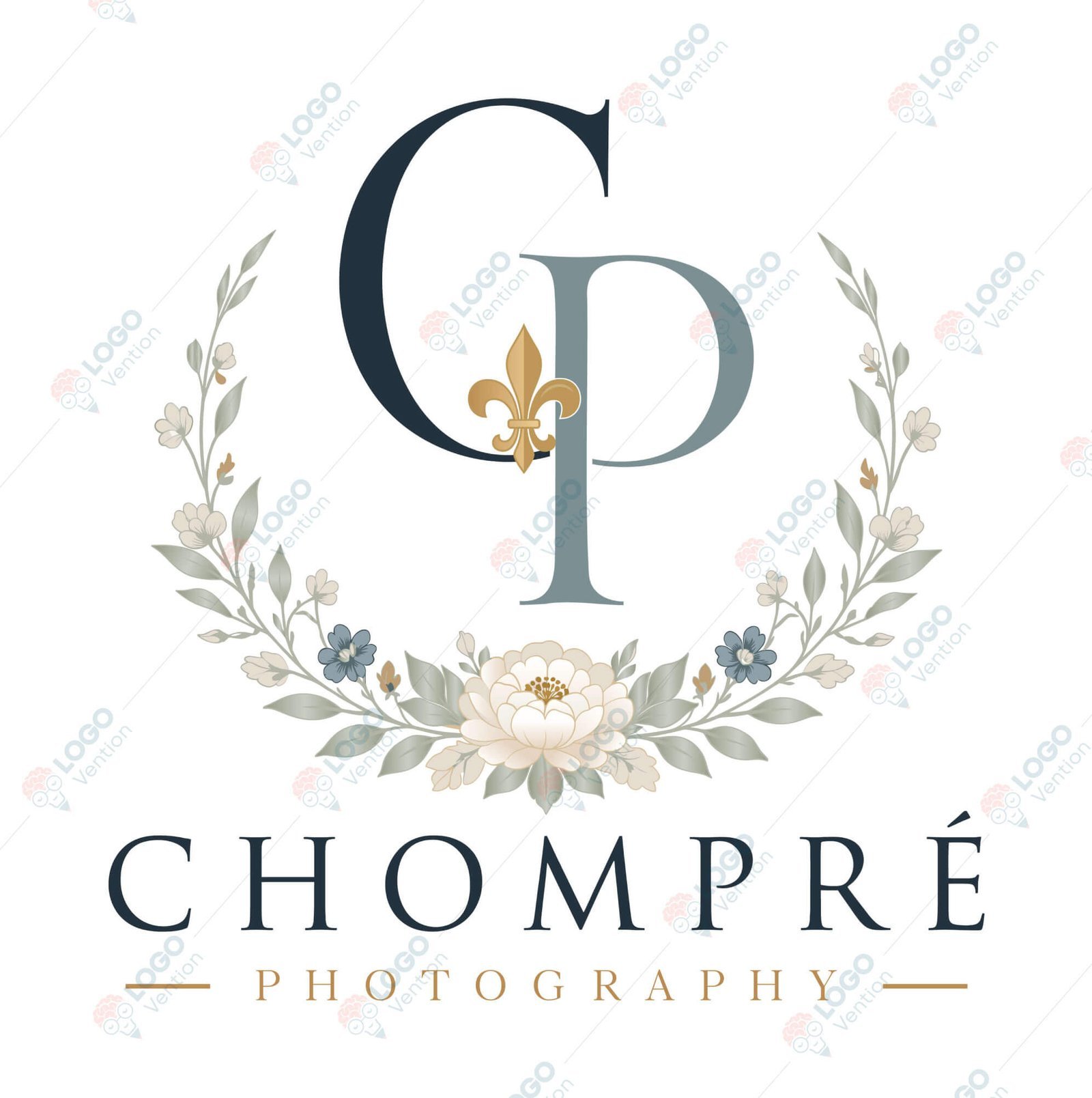
6. Emblem logos
An emblem places lettering and imagery within a badge, seal, or enclosing shape. It can suit organizations that want a unified, badge-like presentation. Check fine details carefully: a design that works on a sign may need simplification for embroidery.
7. Mascot logos
A mascot logo uses an illustrated character. It can suit a business seeking an expressive, personable presentation. A detailed character may work well in larger applications while needing a simpler companion mark for a tiny profile picture.
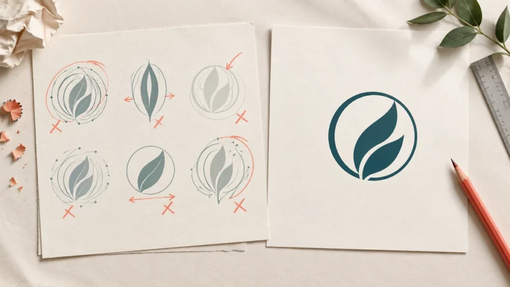
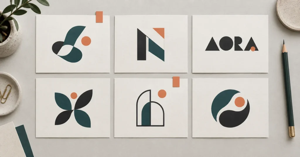
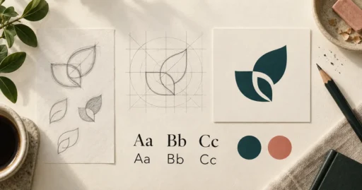
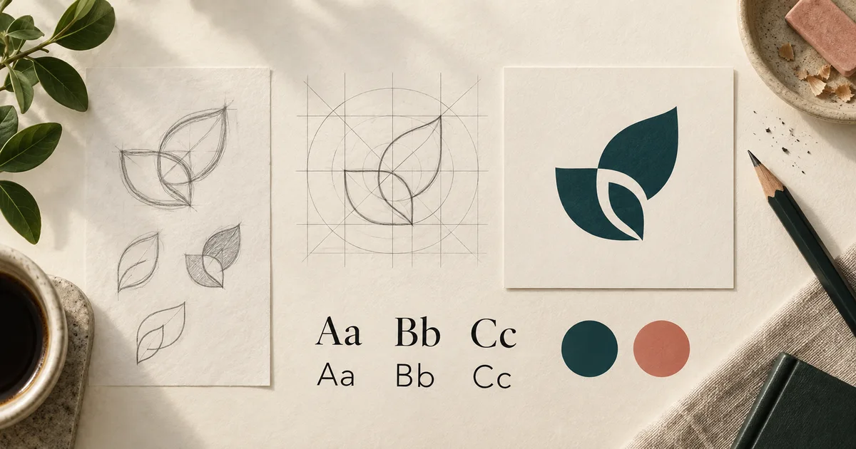
These are examples of LogoVention’s work, not evidence of a particular business result. See more approaches in our logo design portfolio. The cover image is a conceptual illustration of logo construction.
What Makes a Good Logo?
An effective logo fits its audience and the business’s positioning while remaining usable. Evaluate a proposal against actual applications:
- Can you read the name at the size it will appear on a phone?
- Does it look sufficiently different from businesses customers might confuse with yours?
- Are its details clear in both digital and printed versions?
- Can it work in one color and reversed out on a dark background?
- Are there suitable horizontal, square, and compact variations?
- Does its style fit the intended audience without relying on a generic industry symbol?
“Simple” is a useful direction, not an absolute rule. An illustrated emblem can be appropriate if its details reproduce well. “Timeless” is also an aspiration, not a guarantee: the goal is to avoid choices that only make sense because they are fashionable today.
What Elements Make Up a Logo?
Typography determines how the name reads. Letter style, weight, and spacing affect both personality and legibility. Color helps establish a consistent appearance, but meanings vary with audience and context; one color does not guarantee a particular emotional response.
Shapes and symbols provide recognizable forms. Proportion and layout establish the relationship between a name, icon, and optional tagline. Negative space—the unfilled area within and around forms—helps prevent crowding and can sometimes contribute an additional shape.
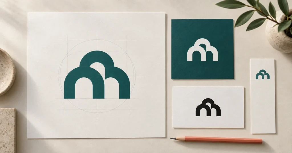
Supporting variations are part of the practical system. A stacked arrangement, a horizontal version, and a simplified mark should look related rather than like three different businesses.
Where Is a Logo Used?
Common applications include websites, social-media profiles, business cards, email signatures, packaging, signage, uniforms, vehicles, advertising, mobile applications, invoices, and promotional merchandise.
Each creates different constraints. A website header is often wide and shallow; a profile image is usually compact. A vehicle graphic must be readable at a distance. An embroidered uniform may not reproduce delicate lines.
Plan horizontal, stacked, and icon-only versions where needed, plus full-color, black, and white artwork. You do not necessarily need every version immediately, but knowing the intended uses prevents expensive surprises after design approval.
Which Logo File Formats Do You Need?
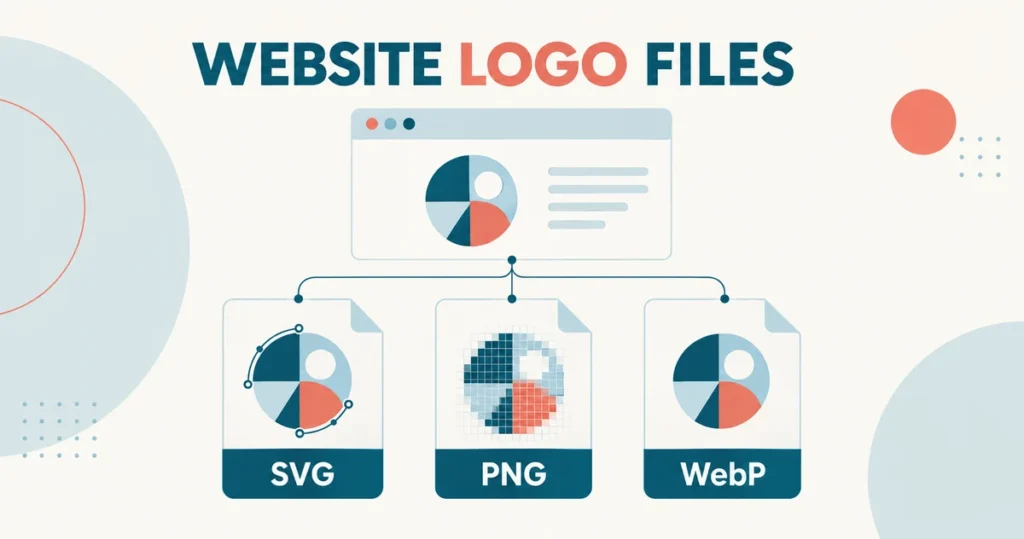
Raster images use pixels; vector artwork uses mathematically described paths. Enlarging a small raster image can expose its pixel structure, while vector paths scale without that problem. Adobe explains this distinction in its image essentials guide.
| Format | Useful for | What to check |
|---|---|---|
| PNG | Web graphics and transparent backgrounds. | Pixel dimensions must suit the intended use. |
| JPEG | Simple previews on a solid background. | No transparency; repeated compression can reduce quality. |
| SVG | Scalable web graphics and compatible design workflows. | Confirm the file contains vector artwork and displays correctly. |
| EPS | Vector exchange with some print and production suppliers. | Ask whether the supplier needs EPS or a newer format. |
| AI | An editable Adobe Illustrator master. | Check linked assets, fonts, and software compatibility. |
| Sharing and print workflows. | A PDF can contain vector paths, raster images, or both. |
Saving a JPEG as a PDF does not turn it into vector artwork. Ask for usable master files and exports matched to your needs. If only a small image remains, discuss logo refinement and vectorization; rebuilding usable artwork may require more than changing its extension.
How Is a Professional Logo Created?
The process typically moves from a business brief and research to concepts, typography and color exploration, presentation, feedback, refinement, and final file preparation. The brief should identify the audience, intended applications, and constraints before artwork is approved.
For the detailed workflow, read our practical step-by-step guide to making a logo. This article focuses on understanding what the finished mark needs to do.
Common Logo Mistakes to Avoid
- Copying another company: visual similarity can confuse customers and create legal problems.
- Ignoring reproduction: tiny lettering, delicate details, or one-background-only artwork may fail in everyday use.
- Following trends without a purpose: a fashionable treatment may not fit the audience or business.
- Keeping only a low-resolution JPEG: retain appropriate master artwork and clearly labeled variations.
- Skipping rights checks: verify permissions for fonts, stock graphics, and other incorporated assets.
- Expecting the logo to replace strategy: positioning, messaging, and customer experience still need attention.
Trademark checking is more than looking for an identical image. The USPTO recommends a comprehensive search for similar trademarks, including potentially conflicting uses beyond federal registrations. A qualified trademark professional can help assess the relevant risks.
Copyright and trademark are different protections. The U.S. Copyright Office explains that names, short phrases, and familiar symbols generally are not copyrightable; sufficiently original graphic artwork may be. Do not assume that buying a design automatically establishes every legal right you need.
Do You Need a Professional Logo Designer?
You can create your own logo. DIY and AI tools can suit experiments, personal projects, internal concepts, or owners comfortable making design and production decisions themselves. Check usage terms and output files before committing to a commercial application.
Professional help may be valuable when the mark will appear on packaging or signage, you need guidance, an existing design needs refinement, or several formats and variations must work together. A broader identity system adds further coordination.
LogoVention offers collaborative professional logo design services. The useful comparison is the scope of support and deliverables you need—not a blanket claim that every professional design is better than every DIY result.
Build a Logo Around Your Business
A logo is one part of a business identity, but it needs to work in many places. Start with what people should recognize and where they will see it.
Not sure which style or file format fits your business? Tell the LogoVention team about your company, audience, and intended uses. We can help you select an appropriate design direction and package.
About the LogoVention Design Team
The LogoVention Design Team works on custom logo design, logo redesign, vectorization, and brand identity projects. Our educational content combines practical design considerations, portfolio examples, and research from reliable sources.