
The principles of good logo design are clarity, relevance, distinctiveness, memorability, visual balance, versatility, and durability. Together, they help a business mark identify the right organization, remain recognizable, and work in its intended settings. Treat them as connected design goals, not a formula that guarantees a successful brand.
Choosing between concepts becomes easier when you can explain why one works. Instead of asking only which design you like, ask what customers can read, recognize, and distinguish—and what happens when the artwork leaves the presentation screen. This guide gives business owners a practical way to make that judgment.
Seven Principles of Good Logo Design, With a Decision for Each
There is no single official number of logo-design principles. Different guides group the same concerns differently. The seven below separate the decisions that tend to become blurred during a review: simplifying the artwork, choosing its character, and making it usable are related tasks, but they are not interchangeable.
| Principle | What it contributes | A useful review question |
|---|---|---|
| Clarity | A readable name and a focused visual idea | What can be removed without weakening identification? |
| Relevance | A character suited to the business and audience | Why is this tone appropriate for the people we serve? |
| Distinctiveness | A recognizable difference from nearby alternatives | Which feature helps this look like our business? |
| Memorability | An identity people can learn and recognize again | What remains in someone’s description after looking away? |
| Visual balance | Intentional relationships between shapes and lettering | Does anything attract attention for an accidental reason? |
| Versatility | Reliable use across sizes, backgrounds, and materials | Which approved variation works in each required placement? |
| Durability | A reason for the design that outlasts a short fashion cycle | Would the core idea still fit if this visual trend faded? |
1. Clarity: Keep the Part That Does the Identifying
Simplicity is useful when it makes a logo easier to understand and reproduce. It becomes unhelpful when simplification removes the very feature that distinguishes the business. A generic circle is simple; that alone does not make it a strong identity.
Identify the job of every element. The name identifies the organization. A symbol may add a distinctive cue. A descriptor can clarify an unfamiliar business. An extra border, slogan, or illustration should earn its place rather than compete with those tasks.
Consider a fictional neighborhood bakery choosing between a detailed storefront illustration and a compact name with one wheat-shaped letter detail. The second direction might work better on a small bag label. A large heritage emblem could still suit the shop window. The principle is appropriate complexity, not a ban on illustration.
Decision to make: agree which elements must be recognizable in the smallest important use. Keep secondary information in supporting materials or a larger logo arrangement if it cannot remain readable.
2. Relevance: Express the Right Character Without Explaining Everything
A logo should feel appropriate for the business’s positioning and the people it wants to reach. That does not mean it must draw the product. A consultant can use lettering alone; a food business can use an abstract symbol. The surrounding name, message, and customer experience also communicate what the business does.
Write a short statement of the desired impression before judging styles: for example, “approachable expertise for first-time homebuyers” is more useful than “make it professional.” Ask the designer to connect choices in shape, weight, spacing, and color to that statement.
A playful identity might suit a children’s activity service, while a more restrained treatment might better support a specialist advisory firm. These are starting hypotheses to examine with the intended audience, not universal rules about industries or colors. Do not assume that blue always produces trust or that every premium business needs gold.
Decision to make: choose a direction you can explain in terms of the audience and offer. If you are still defining that foundation, explore a custom identity shaped by your business brief.
3. Distinctiveness: Make the Difference Specific
Distinctiveness means the mark has a recognizable character of its own in the context where customers encounter it. Being visually unusual is not enough: a surprising shape that obscures the name can solve one problem while creating another.
Look for a particular relationship—a letter connection, silhouette, proportion, or use of empty space—that remains identifiable after the decorative background disappears. Compare the concept with direct competitors at the same size and on the same neutral background. This helps separate a strong mark from a strong presentation.
In Paul Rand’s presentation for The Limited, the designer discusses specific letter relationships, readability, and the arrangement of the name. The useful lesson is the attention given to the actual word, rather than simply selecting a fashionable typeface. This is an interpretation of his documented design reasoning, not a promise that the same treatment suits another business.
Decision to make: name the feature that belongs to this concept. If the explanation could describe almost every competitor, ask for a more specific idea. A visual comparison is a design exercise; it does not establish legal clearance.
4. Memorability: Give People Something Consistent to Learn
A memorable logo has a feature people can recognize again. Recognition and recall are different questions: someone may identify a mark when shown it without being able to draw it from memory. A new business should not expect the familiarity of a brand people have encountered for years.
For an informal review, show a concept to a few relevant people, move to another topic, then ask what they remember. Listen for the name, shape, and distinguishing feature. Do not lead with “Did you notice the clever arrow?” That tests whether they agree with your explanation, not what they noticed themselves.
This small exercise is qualitative feedback, not a scientific recall study. It can expose an unreadable name or an unintended association, but it cannot predict sales or establish a statistically reliable recognition rate. A slightly unfamiliar concept may also need time before people become comfortable with it.
Decision to make: keep a clear, repeatable identifier and use it consistently. Do not keep changing the symbol, lettering, and colors in pursuit of instant approval.
5. Visual Balance: Refine What the Eye Sees, Not Just the Grid
Balance concerns the visual weight of the parts. It does not require perfect symmetry. A broad symbol may need different spacing beside a narrow wordmark than beside a heavy one. A tagline can be mathematically centered and still feel displaced because the shapes above it are uneven.
Review the actual business name, not a font sample. Look at letter pairs, gaps inside and around the symbol, the relationship between the icon and name, and the transition from large to small text. Pay particular attention to any gap or stroke that appears accidental.
IBM provides a concrete example of optical adjustment: its official 8-bar construction and usage notes explain that the positive and reversed logos use different bar weights and counter details so they appear visually consistent on light and dark backgrounds. Equal-looking shapes do not always require mathematically identical treatment.
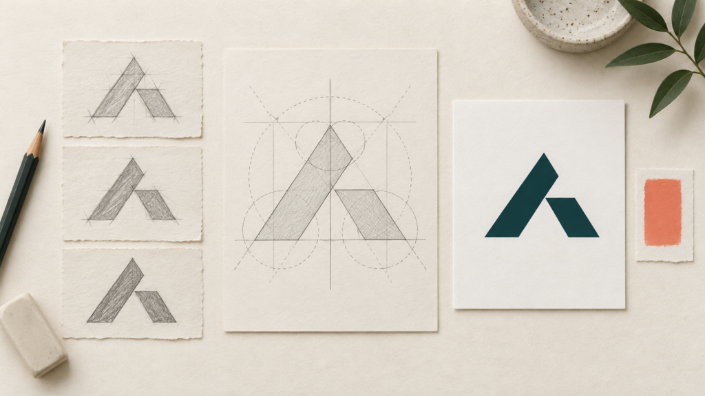
Decision to make: ask whether a refinement improves the visible result at the intended size. Construction circles and grids can help a designer work, but their presence is not proof of quality.
6. Versatility: Preserve the Identity as the Setting Changes
Versatility is the ability to remain useful across the applications the business actually needs. Scalability is one part of it. A vector file can keep edges sharp when enlarged, but it cannot make tiny lettering readable or prevent fine details from merging.
A complete arrangement with a descriptor may work on a sign. A shorter arrangement may fit a website header. A compact companion mark may suit a profile image. These should feel related through consistent shapes and lettering rather than becoming unrelated designs.
- Check the main arrangement at its real display size, without zooming in.
- Review an appropriate version against both light and dark backgrounds.
- Request a one-color proof when stamps, engraving, or single-ink printing are part of the brief.
- Ask the production supplier about limits for embroidery, cutting, or other specialist processes.
Color and background need particular care. W3C’s distinction between logotypes and ordinary text states that logo and brand-name text is exempt from its minimum text-contrast requirement. That exemption is not a recommendation to use faint artwork. Choose combinations people can see clearly, and evaluate surrounding website text under the requirements that apply to it.
Decision to make: specify the required versions and minimum usable sizes for your project. For the digital handoff, read which exports preserve your mark in a website header.
7. Durability: Give the Core Idea a Longer Reason to Exist
“Timeless” is an ambition, not a guarantee. Businesses evolve, languages and tastes change, and identities sometimes need updating. The useful question is whether the core design has a reason beyond being popular this season.
A distinctive relationship to the business name, a suitable character, and dependable reproduction provide firmer grounds for a choice than a currently fashionable effect. That does not automatically rule out gradients, expressive type, or contemporary styling. It means understanding what would remain if the surface treatment changed.
IBM says the basic design of its logo has remained unchanged since 1972. That is a documented example of longevity, not evidence that copying its style would make another identity last. Its continuity also depends on consistent application. The practical lesson is to establish a stable core and manage its use.
Decision to make: distinguish the identifying mark from the campaign graphics around it. You can refresh photography and promotional layouts without repeatedly replacing the business identifier. A shared visual framework for everyday brand materials helps keep those relationships clear.
When Good Principles Pull a Concept in Different Directions
A design review is rarely seven independent yes-or-no answers. More detail may increase character but reduce small-size clarity. Wider spacing may improve reading but make a name harder to fit. A highly familiar industry symbol may explain the service while making the business look interchangeable.
Set priorities from the brief rather than adding up an arbitrary score. A delivery business may need a quickly readable vehicle identifier. A specialist product may need an unmistakable name on a narrow label. Neither situation is solved by choosing the most elaborate presentation.
- Write the non-negotiables. List the exact name, essential placements, and audience needs.
- Record what you observe. “The descriptor disappears on the label” is more actionable than “something feels off.”
- Identify the tradeoff. Decide whether to simplify, change the arrangement, or provide a companion version.
- Request a targeted revision. Ask for the smallest meaningful adjustment before abandoning a promising direction.
Use well-chosen references for comparing visual approaches to describe your preferences. If an existing logo has a clear functional problem, our diagnostic guide to weak lettering and other logo faults can help you frame the issue without turning this principles review into a complete redesign process.
Choose a Concept You Can Explain and Use
Share your audience, intended applications, and the decisions you are unsure about with LogoVention. We can discuss a design direction and the variations your business needs, with the scope agreed before work begins.
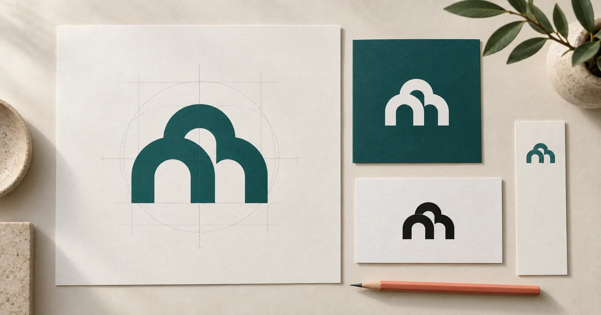
Written by LogoVention. This guide combines practical design evaluation with the primary references linked above. The cover is a conceptual illustration, not a client case study. Sources checked September 24, 2026.