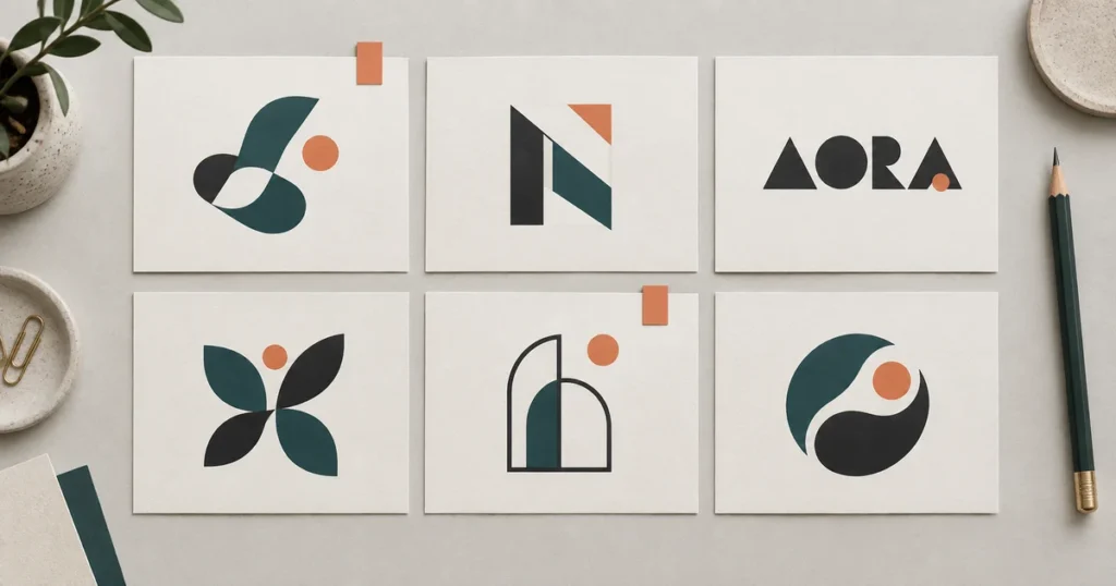


Common mistakes in logo design include unclear brand direction, excessive detail, unreadable lettering, weak contrast, copying familiar symbols, and approving artwork without testing real uses. Missing variations, unsuitable files, and unclear usage rights can cause problems after approval. The fix is to judge the logo against its audience and applications, not just how attractive it looks in a presentation.
A logo can look polished on a large screen and still fail on a mobile header, invoice, uniform, or shop sign. Use this guide to identify the problem, give your designer useful feedback, and decide whether you need a small correction or a more substantial redesign.
What Looks Wrong—and What to Check First
Before changing the design, separate an artwork problem from an implementation problem. A fuzzy website image may be the wrong export; an unreadable business name may need a typography revision. Those are different jobs.
| Visible symptom | Likely area to review | First useful action |
|---|---|---|
| Details merge when the logo shrinks | Complexity and stroke weight | Test a simplified version at the intended size. |
| People misread the name | Letter shapes and spacing | Ask someone unfamiliar with the business to read it aloud. |
| It disappears on a dark background | Contrast and missing variations | Prepare an approved light or reversed version. |
| It resembles another business | Distinctiveness and potential rights conflicts | Review category references and arrange appropriate clearance. |
| It looks stretched or pixelated | Placement or export quality | Compare the displayed file with the original artwork. |
| Every supplier uses a different version | Handoff and usage instructions | Issue one approved folder and a short usage guide. |
On a phone, swipe across the table to see the suggested action.
These are diagnostic starting points, not a measured ranking of how frequently mistakes occur.
1. Choosing a Style Before Defining the Customer
“Make it modern” leaves too much unanswered. A playful treatment might suit a children’s craft club and feel out of place for a specialist accounting firm. Personal taste matters, but it cannot be the only basis for choosing a business identity.
Correct it: write down who needs to recognize you, what you offer, and the impression the logo should create. Replace vague preferences with practical requirements such as “easy to identify on a delivery van” or “confident without looking exclusive.”
Ask each decision-maker to evaluate the same brief. If the brief is still unsettled, revisit the decisions that should come before drawing a mark instead of collecting more unrelated concepts.
2. Asking One Mark to Tell the Entire Business Story
A symbol, location, founding date, slogan, product illustration, and decorative border can compete for attention. The problem is not detail by itself; it is detail that prevents the main identifier from doing its job.
Imagine a fictional neighborhood bakery putting a loaf, wheat stalks, an oven, a rolling pin, and its full address into one badge. Removing the address and secondary illustrations gives the name more space without removing the bakery’s character.
Correct it: identify the element people should notice first. Remove or separate anything that weakens that hierarchy. An illustrated emblem may still be appropriate, but it may need a simpler companion version for small spaces. Minimalism is an option, not a rule every brand must follow.
3. Treating Lettering as Decoration Instead of a Name
Ambiguous letters, tightly packed words, and competing type styles can make a business name harder to read. A fashionable font is not useful if customers keep reading a different word.
Correct it: inspect the actual letter combinations in your name. Adjust the space between individual letters, word spacing, and the balance between the name and any descriptor. Adobe’s typographic-logo lesson on spacing and alignment demonstrates why choosing a font is only part of the work.
There is no universal rule that every logo must use exactly one font or that script lettering is always wrong. Judge the combination at its real size. Ask an unfamiliar reader what the name says before telling them the answer.
4. Approving the Enlarged Version and Ignoring the Small One
Hairline strokes and tiny taglines can look elegant when the artwork fills a screen. At a much smaller size, gaps may close and words may stop being readable.
Correct it: show the logo at the smallest size you actually intend to use. For example, you might test a compact symbol at 24, 32, and 48 pixels, and a full wordmark at your planned website-header width. These are useful trial sizes, not industry-wide pass marks.
Print a sample at its intended physical dimensions too. If the logo will be stitched, engraved, or cut from vinyl, ask that supplier for its minimum detail requirements and a proof. A scalable file preserves geometry; it does not guarantee that every manufacturing process can reproduce it.
5. Relying on Color or Effects to Hold the Shape Together
A gradient may separate two forms beautifully on screen but provide no separation in a one-color stamp. Pale lettering can also disappear against a light background. Simply adding more saturated colors does not solve either problem.
Correct it: review the mark in full color, one solid color, and a reversed version on a dark surface. Make sure the central shape remains understandable without a shadow or metallic mockup. Keep decorative effects where they add value, with a practical alternative for restricted uses.
Be precise about accessibility claims. W3C’s contrast guidance explicitly exempts logotype text from the minimum text-contrast requirement. That is not a reason to make your identity difficult to see, and it does not exempt the rest of your website’s text. Check the actual background rather than claiming that every logo must meet a universal 4.5:1 ratio.
6. Borrowing So Much That the Result Looks Familiar
A generic symbol may identify your industry without giving people much that identifies your business. Copying a competitor’s distinctive arrangement and changing its color creates a more serious concern than simply sharing a common category motif.
Correct it: compare silhouettes, lettering, composition, and overall impression alongside nearby competitors. Use references to understand the market, not as templates to trace. Ask what makes this particular combination recognizable as yours.
Visual research is not legal clearance. In the United States, the USPTO recommends checking for confusingly similar marks used with the same or related goods and services, using sources beyond its federal database. Its explanation of a comprehensive trademark search describes the scope. Seek advice relevant to your jurisdiction when a possible conflict matters to your launch.
7. Letting a Trend Replace a Lasting Reason for the Design
A current treatment can be appropriate. The mistake is approving it only because other brands are using it, without considering whether it suits your audience or survives outside the presentation.
Correct it: remove the fashionable effect temporarily and review the underlying name and symbol. Can you explain the choice in terms of your business? Does it still work in the places it must appear?
A distinctive identity does not have to look timeless in an absolute sense. It needs a coherent reason to exist beyond this month’s inspiration board. Keep experimental campaign graphics separate from the core mark when frequent change is part of your marketing.
8. Stretching, Crowding, or Rearranging the Approved Artwork
Even a well-designed logo can look wrong after someone forces it into a template. Stretching it to fill a box changes its proportions. Placing it against nearby text can make separate elements appear connected.
Correct it: resize proportionally and use the appropriate approved arrangement. Request a horizontal version, a stacked version, or a compact symbol when the application calls for it, rather than squeezing one layout into every space.
Agree on clear space and minimum sizes for your mark. There is no single padding measurement that works for every design. A short usage sheet should explain which versions to use and show the distortions or placements to avoid.
9. Letting a Beautiful Mockup Make the Decision
Embossed paper, dramatic lighting, and a glossy storefront can make almost any proposal feel more expensive. They are useful previews, but they can conceal weak spacing or a symbol that only works with those effects.
Correct it: compare the flat artwork first, on the same plain background and at comparable sizes. Then view it in realistic applications. The mockup should answer “will this work here?” rather than substitute for reviewing the design itself.
Give specific feedback: “The descriptor disappears at this width” is actionable. “Make it pop” is not. Keep one person responsible for consolidating comments so the designer does not receive contradictory instructions from several people.
10. Receiving an Image Without a Usable Handoff
A preview JPG is not necessarily the complete deliverable. You may later need transparent artwork, an editable source, or a vector version that a production supplier can use. Paying for a logo does not mean every possible format was included.
Correct it: agree on formats and variations before approval. Keep the editable master separate from the copies intended for your website or printer. Confirm what is genuinely vector rather than assuming a file extension proves it.
For the website-specific decisions, use our comparison of SVG, PNG, and WebP for live site logos. This prevents an export problem from being mistaken for a reason to redesign an otherwise suitable mark.
11. Assuming Every Download Includes the Rights You Need
A font or graphic found online may have conditions on commercial use, modification, redistribution, or use in a trademark. “Free to download” is not the same as “unrestricted.” Keep the source and license information with the project.
Correct it: confirm the permitted use of each third-party component and the rights agreed with the designer. Treat artwork ownership, font access, and trademark clearance as separate questions.
For example, Adobe Fonts’ rules for client artwork and editable fonts distinguish finished graphics from a client’s direct access to the font software. Those terms apply to Adobe Fonts; other foundries and asset providers may differ. Do not assume converting lettering to outlines erases a licensing problem.
12. Launching Without a Single Approved Reference
The final design can drift when staff and suppliers use old attachments, recolor the mark, or recreate missing versions. Repeated small changes can make the same business look inconsistent across channels.
Correct it: maintain one clearly labeled folder of approved files, with a dated reference sheet. Include the permitted arrangements, colors, backgrounds, and a contact for unusual applications. Archive superseded artwork separately so it is not mistaken for the current version.
If the problem extends to typography, stationery, and marketing layouts, consider a coordinated set of brand usage standards. A new logo file alone will not resolve an inconsistent identity system.
Put the Finalists Through One Consistent Review
Use a single approval sheet so every concept faces the same conditions. This is a practical review method, not a scientific score or a guarantee of commercial success.
- Plain artwork: show the mark without texture, lighting, or perspective effects.
- Small application: place it at the planned mobile-header or profile size.
- Restricted reproduction: show an intentional one-color version, not just an automatic grayscale conversion.
- Background changes: place approved versions on light and dark surfaces.
- Real production: include a supplier proof for the most demanding physical use.
- Independent reading: ask an unfamiliar person to read the name and describe the impression, without coaching them.
Record the failure and the requested correction. A simple note such as “the inner gap closes on the uniform proof” gives the designer a concrete issue to solve. After revising it, repeat the affected check rather than reopening every settled choice.
Repair the Weak Point or Start a New Direction?
Refinement may be enough when the name and core symbol still fit the business, but spacing, stroke weight, proportions, or available versions need attention. A clean redraw may solve an artwork-quality problem while keeping the recognizable identity.
A broader redesign may be justified when the mark communicates the wrong position, conflicts with another identity, or cannot meet essential applications without changing its central idea. Do not discard familiar elements merely because you have become tired of seeing them.
Bring the current artwork and examples of where it fails when discussing targeted corrections to an existing business logo. For a new business, start with a logo concept developed around your audience and agree on review criteria before the first presentation.
Resolve the Problem Before It Reaches Your Signage
Show LogoVention where your logo feels unclear, looks inconsistent, or becomes difficult to reproduce. Tell us which applications matter most, and we can discuss whether focused refinement or a new direction fits the project. Confirm the revision scope and deliverables before ordering.
Prepared by LogoVention. References checked September 19, 2026. The cover and bakery scenario are illustrative teaching examples, not client case studies. This guide does not claim a statistical ranking of mistakes or measured sales outcomes.