
You can see modern logo design examples in LogoVention’s portfolio, Behance’s logo gallery, Dribbble’s modern-logo feed, LogoLounge’s searchable archive, and Brand New’s identity reviews. Start with a portfolio for business-specific ideas, a project gallery for context, or a rebrand review to understand why an identity changed.
The useful question is not simply “Which logo looks good?” It is “What could this approach help my customers understand?” A polished symbol on a screen may reveal very little about how it works on a shopfront, an invoice, or a small phone display. This guide shows where to look and what to take away from the examples you find.
Resource access and features checked September 22, 2026. The cover is a conceptual illustration; the two named business logos below are from LogoVention’s own portfolio.
Five Places to Look—and What Each Can Tell You
These resources serve different purposes. Use the table to choose your starting point, then open individual projects rather than collecting thumbnails without context.
| Resource | Useful for | Check before drawing conclusions |
|---|---|---|
| LogoVention portfolio | Exploring industry categories and our design range | A portfolio image alone does not document business results |
| Behance | Seeing logo projects alongside wider identity presentations | Whether the project is client work, a concept, or a redesign exercise |
| Dribbble | Scanning visual directions and individual logo treatments | Whether a striking preview includes a complete identity system |
| LogoLounge | Searching an attributed logo archive by relevant characteristics | Membership requirements for the features you need |
| Brand New | Reading identity-change coverage and before-and-after comparisons | Subscription access and the distinction between critique and measured results |
Start close to your market in the LogoVention collection
Our service page groups work under categories including Custom, Technology, Food & Drink, Fashion, Health, Real Estate, Travel, Education, Beauty, and Sports. You can browse LogoVention’s industry collections to compare different kinds of businesses without beginning with a blank search box.
Look beyond your own category, too. A construction business might borrow the principle of clear name hierarchy from a hospitality identity without borrowing its lettering or symbol. Save the reason an example interests you, not just the image. The portfolio demonstrates visual approaches; it is not evidence that a particular mark increased a client’s sales.
Open Behance projects when you need the surrounding story
The curated logo projects on Behance provide an entry point into individual presentations and logo collections. Open a project to see whether its creator supplies sketches, typography, colors, applications, or an explanation of the idea.
A longer presentation can help you judge consistency across materials. Still, read its description: a self-initiated concept and a launched client identity are different kinds of evidence. Attractive mockups do not establish that the design was commissioned or used.
Use Dribbble for a quick survey of visual possibilities
The modern-logo designs collected on Dribbble let you scan many treatments in one place. Use the feed to identify a direction—compact monograms, expressive lettering, or simple symbols—then inspect the creator’s explanation.
A small preview is useful for discovery, but it may omit the long business name, a reversed version, or the wider identity. Treat popularity as a browsing signal, not proof that a design would work for your audience. Shortlist the approach only after you can describe why it is relevant.
Search LogoLounge when you want a more structured archive
LogoLounge’s attributed logo library advertises more than 450,000 curated logos and search options including keyword, type, industry, and award status. That makes it a useful research destination when broad visual feeds become difficult to narrow down.
The archive is membership-oriented, so check current access before planning your research around it. Its published trend reports can introduce recurring visual approaches, but the existence of a trend is not a reason to adopt it. Ask whether the idea suits your name, customers, and applications.
Read Brand New when the decision behind a rebrand matters
Brand New’s identity reviews and before-and-after coverage focus on new and updated identities. Its categories and review formats are useful when you want to examine a change rather than an isolated symbol.
Compare what the old identity communicated with what the new system emphasizes. Is the name clearer? Does the identity extend across applications? Some access requires a subscription. Editorial opinions and reader reactions provide perspectives; they do not, by themselves, measure commercial success.
“Modern” Describes a Direction, Not One Mandatory Style
A modern logo need not be a thin-line icon, a lowercase wordmark, or an abstract shape. In this guide, the term means an identity that feels appropriate to its present audience and can work across the places the business appears. That leaves room for bold lettering, badges, organic shapes, and more expressive designs.
As you browse, separate the visible design choices from the fashionable presentation around them:
- Shape: Can you recognize the main idea without the mockup, shadow, or textured background?
- Lettering: Does the name read clearly, and does its tone fit the organization?
- Hierarchy: Do the business name, descriptor, and symbol have a clear order of importance?
- Adaptability: Is there evidence of a workable small version or an alternative arrangement?
- Character: Is there a meaningful detail you could describe after looking away?
Use those observations to compare examples. A restrained palette can support clarity, but a colorful design is not automatically outdated. Likewise, a detailed emblem can suit a business even when it needs a simplified companion for tiny placements. Judge the intended use, not a rule that every current brand must look minimal.
Two LogoVention Examples, Two Different Visual Priorities
The following work appears in our Custom collection. These are observations about the visible artwork, not claims about the client brief, launch date, or business performance.
J&J Construction Services: initials supported by an industry cue
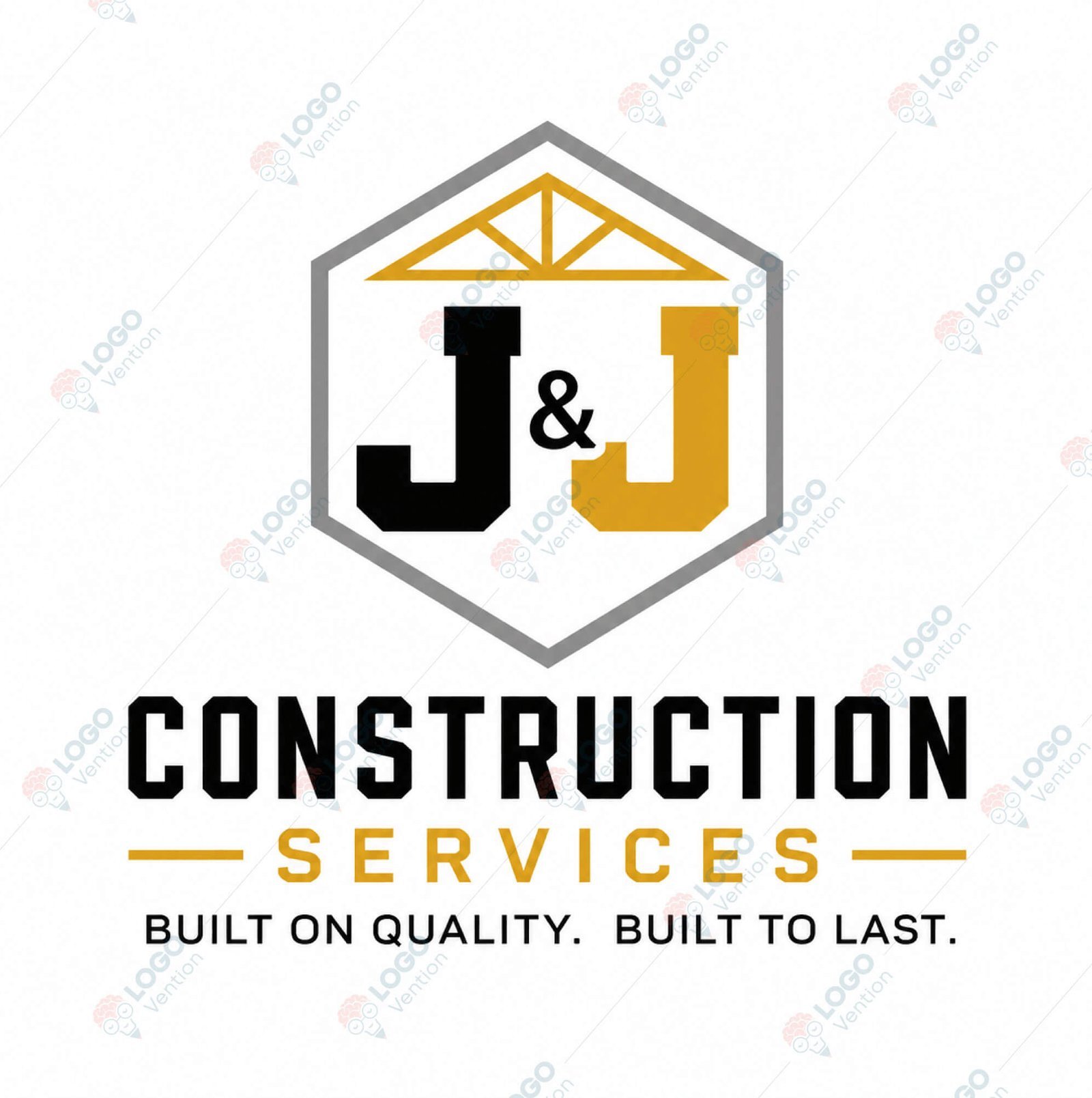
The block initials carry the center of the design. A roof-truss motif gives a construction cue, while the gray enclosure connects the elements. Black and gold separate the name, structure, and supporting text without introducing a large color palette.
What to learn: a recognizable business cue can support a letter-based identity without replacing the name. For your own project, test whether the initials remain distinguishable when the artwork is small. The full descriptor and tagline may need a larger placement than the central mark.
Parrish Plumbing: a badge that makes the service explicit

Here, the pipe valve and water droplet communicate the service directly. The large business name dominates the navy badge, with orange emphasizing “Plumbing.” The smaller line identifies commercial and medical-gas work.
What to learn: an emblem can organize a name, service, and symbol into one compact unit. The tradeoff is information density. If you like this direction, ask to see it at the size of your real placements and discuss which secondary details should remain in a reduced version.
Neither approach is a universal winner. Compare what each prioritizes, then see additional identities in our project gallery before deciding which principles fit your business.
Replace “Cool Logos” With a Search That Has a Purpose
A broad query produces broad results. Combine three ingredients: your industry or audience, a visual approach, and the application you need to evaluate. These are suggested research phrases, not search-volume claims:
- “Architecture wordmark signage” when the name must be legible on a building.
- “Skincare identity packaging” when the mark must work on small labels and product ranges.
- “Software monogram app icon” when a compact digital identifier matters.
- “Restaurant logo menu identity” when the logo must belong to a broader dining experience.
Broaden one ingredient if the results are too similar. For example, a professional service can study editorial wordmarks for typographic hierarchy without imitating a publisher. Search within a platform, then follow a promising project to its full presentation. Save the original page so you can return to its context and creator.
Also check the date and status of the work. “Newly uploaded” is not necessarily “newly launched,” and a concept labeled as a redesign may be independent of the named company. When the distinction is unclear, treat it as a visual reference rather than an official brand case study.
Make a Small Reference Board That Explains Your Taste
As a practical starting point, choose six to eight references. This is a manageable working limit, not a design standard. Include a few different directions so your brief does not accidentally become an instruction to reproduce one existing logo.
- Record the source. Keep the project link, creator name, and any stated client or concept status.
- Name the useful feature. Write “clear spacing between letters” rather than “looks premium.”
- Connect it to a requirement. Explain where that feature could help, such as a readable name on a delivery vehicle.
- Note what you would not carry over. The palette, symbol, or overall composition may be wrong for your business even when one principle is useful.
- Add a real constraint. Include your longest name version, smallest placement, or existing brand color.
For example: “I like how this wordmark keeps the business name dominant. Our name also needs to be readable on an invoice. I do not want its letter shapes or blue palette.” That gives a designer a direction and a reason, while leaving room for an original solution.
A reference board is not a parts bin. Do not assemble another company’s symbol, a second company’s lettering, and a third company’s layout into a near-copy. Before you settle on a direction, review the warning signs before choosing a concept.
Bring a Clear Question to Your First Design Conversation
The best outcome from browsing is a better brief. Give your designer your business name, audience, services, intended uses, and a short reference board. Explain what should feel familiar in your market and where you want the brand to stand apart.
Ask for reasoning as well as visual options. Why does this style suit the audience? Which element makes the identity distinctive? What changes when the name is placed in a narrow website header or printed in one color? A useful conversation connects visual preference to decisions you can test.
If you are ready to move beyond collecting examples, our guide can help you move from references to an original design brief. When the project includes more than a logo, consider how to develop a consistent identity around the chosen direction, including typography, colors, and everyday business materials.
Turn Your Shortlist Into a Direction of Your Own
Tell LogoVention what you like, why it appeals to you, and where your logo needs to work. We can discuss an original concept that fits your business rather than reproducing someone else’s identity.
Written by LogoVention. Resource descriptions were checked against the linked platforms. Portfolio commentary is our visual analysis; the article does not claim independently measured client outcomes.